branding
Wired to evolve: building a brand identity from the inside out
Navigating complexity. Being comfortable in uncertainty. Bringing clarity. All in a day’s work for us here at DNA.inc. Turning abstract ideas into delightful-to-use realities is what we do best. We just didn’t expect to bump into the same challenge when the brief was us. Developing DNA.inc’s brand identity meant turning something hard to categorize into something highly legible. Not just to stand out and look good. But for people to read us correctly. Like a good product interface, the more complex the system underneath, the harder the surface needs to work. And like in our client work, we didn’t resist the tensions that came up, we embraced them. Finding answers at the crossroads and beyond the boundaries. Turns out, bridging the gaps and connecting the dots isn’t just what we do. It’s the very essence of who we are.
But wait! What is brand identity, anyway?
Brand identity is often treated as a design problem. A logo. A color palette. A typeface or two. Maybe some authentic, innovative, and passionate adjectives to describe your tone of voice, if you’re feeling ambitious.
But brand identity is more than how your company looks and sounds. It shapes how you show up, everywhere you show up. The values you embody. The personality you project. And, most importantly, the offer you present. It works through two connected systems, visual identity and verbal identity, that bridge brand intention (what you want to convey) and brand experience (how others perceive you). Visual identity shapes how a brand looks and feels. Verbal identity defines the voice, message, and tone. Together, they communicate meaning, not just information.
At its simplest, it’s a platform for consistency and memorability. At its most powerful, it's a living system that tells the world who you are, scales across contexts, and adapts as you grow. Helping people understand your value faster.
For a company like DNA.inc, with no physical product or fancy feature list, and a proposition that doesn’t fit in any one existing category, brand identity isn’t just aesthetic, it’s existential.
On the surface, it may look like picking colors and tuning into tonalites. But in reality, you’re making fundamental choices about how you’re going to be seen. And who you’re going to become.
Positioning before personality
Just one small glitch. We needed to define what the heck we were, before we could explore who the heck we were. It may sound strange – DNA.inc’s been running a successful business for three years, with a 15-year track record of doing similarish things. Surely we know what we’re doing? But there’s a fine line between knowing what you’re doing and knowing how to tell that story. And that’s not an issue unique to us.
Companies all have a dream and branding’s challenge is to make that tangible. A big part of the journey is figuring out who you are and how you want to be perceived by the outside world. In most cases the work you do and the clients you have dictate what this might look like. But what if what you do transcends conventional categories? Or your dreams are bigger than what’s in front of you? How do you build something that can grow and evolve naturally while you figure things out?
For DNA.inc, the complexity was real. The chops of a product design agency. The clout of a staffing agency. And a heady blend of start-up energy and big corporate experience. Throw in an oxymoron of a USP like bringing an outside perspective from an insider position. Then add nearly 70% growth in our team size since the start of last year, and a bigger-picture vision to expand from commercial value to cultural contribution. We’re simply not built to fit in a box. The challenge wasn’t to pick one lane, but to find a form to house all our truths.
Not inventing a stance, uncovering a truth
Marketing often gets a bad rap for being smoke and mirrors. Creative work gets scolded for being too subjective to judge properly. Branding, which defiantly straddles both camps, takes flak from both sides. What keeps it astride its high horse is that good branding is never just random. It’s not something sucked from an art director’s thumb or spun from a copywriter’s hot air. Branding that sticks is strategically and systematically (as close as our domain is ever gonna get to scientifically) sound. It’s not invented, it’s uncovered. Identifying patterns already present and creating pathways for future evolution.
No branding exercise ever starts with a blank page: a blessing, and a curse. Startup or established beast, a brand already looks, feels, and sounds like something. Be that a shockingly bad early iteration of your website or a nebulous notion in the mind of a founder. Decks, posts, pitches, coffee machine conversations – everything out there. And everything in our case turned out to be a lot of very different things. So we took the same approach we take in our client work: lean into the complexity. Resist the urge to oversimplify. Find an interface that can translate complexity into a seamless experience.
Controlling the negative
Most brands have the luxury of relying on shorthands – phrases that glibly position them in their customers’ minds. But when you’re straddling several camps, the cliches from each become dangerous. Yes, we ‘envision, build, and advance’ products, but lead with that, and people think we’re a classic product design agency. Talk too much about ‘embedding senior teams’ or ‘elevating processes’, and suddenly we’re squeezed in a staffing solution box or cramped into the consultancy corner. To be crystal clear about what we are, we had to be brutally honest about what we’re not. In product design terms, staying competitive without becoming generic.
Visually, that meant we had to work twice as hard at proving our craft – on the design and the engineering side. Much of the creative expressions in our competitor landscape feel constructed, like a formula that is being applied. A lot of times there is little to no soul, and most brands are interchangeable. If you start sifting through large quantities of these corporate websites, they quickly start looking and sounding alike. We were looking for something different, something more dynamic and rooted in authenticity.
From a language perspective, every phrase has to be triple checked. Anything generic, vague, or clichéd gets slashed. Not just because same-same is lame. But because careless talk costs clients. One misread, and we’re in the wrong room, with the wrong people, talking about the wrong kind of projects.
Juxtaposition as positioning
Tensions, contrasts, contradictions. We sit at an unusual intersection in the playing field. And we love it in the messy middle. Between disciplines. Across teams. In the beautiful chaos of creativity.
We're very different from the corporate giants, but not when it comes to project scale, experience, and expertise. Our attitude and approach are in another ballpark – but not the one where all the start-ups are playing, either. We’re not beige. But we’re not bananas. Neither legacy thinkers nor reckless reinventors, we bring the stability of proven practice and the energy of change. We are a team that embraces duality, and gets excited by the unity of opposing forces. Seeking out the sweet spot between business and art, and between structure and creativity. We combine a sharp, expert-level approach with a willingness to challenge the usual way of doing things. Instead of sticking to rigid corporate norms, we keep things flexible, creative, and real, while still delivering with precision.
We’re not trying to fit in. And that’s exactly what makes us stand out.
So instead of trying to resolve the contradictions that arose in our brand identity, we made them the foundation. Juxtaposition as positioning. It’s got a nice ring as a philosophy, but it works even better as a practical principle applied to every layer of our brand identity. From brand character to principles, visuals, and voice, we deliberately inhabit the space between.
Exploration. Experimentation. Self-identification.
We uncovered our positioning and personality through creative exploration, treating the process itself as a way to understand who we are, rather than just a means to an end. Instead of defining everything upfront, we leaned into experimentation, letting ideas evolve naturally and reveal their direction over time. This allowed our identity to grow organically, shaped by what felt true rather than what was expected. By building from the inside out, every decision comes from a clear core, not external pressure or trends.
What started as a small seed gradually developed into something more complex and alive, branching out into an ecosystem of ideas, visuals, and ways of thinking. That growth was not random, but carefully guided. We steered where needed, refined when something clicked, and gave structure without over-controlling the outcome. It’s finding a balance between freedom and intention: exploring openly, while still shaping the work into something coherent, meaningful, and distinctly our own.
A key to this uncovering was a strong trust and belief in the process, and being OK with the ambiguity of not always knowing where the quest would take us. This definition of our unique identity was messy at times and generally non-linear, so it was sometimes difficult to see where things were going as we were going through it. Until all the puzzle pieces fell into place.
A visual direction that looks both ways
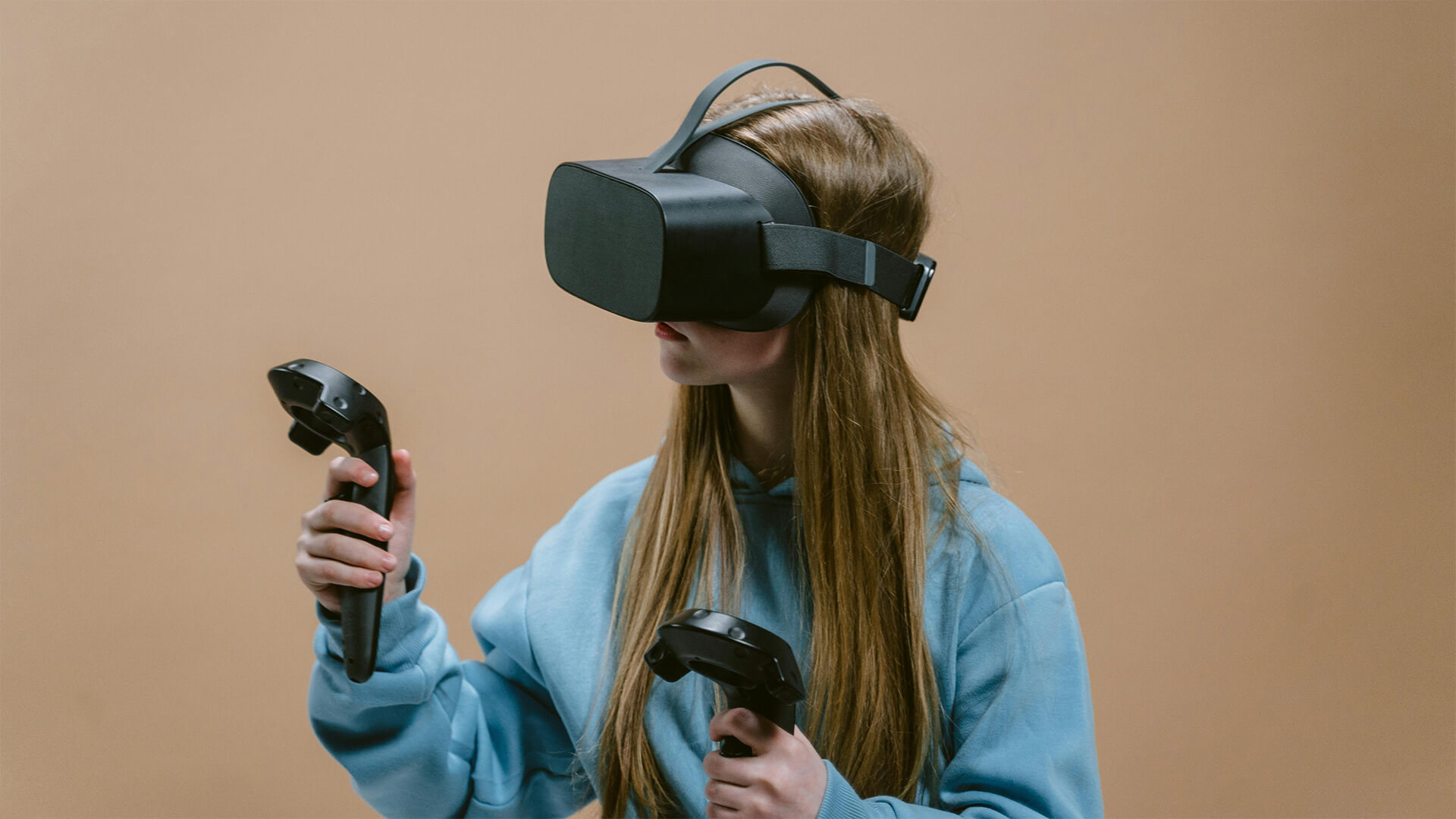
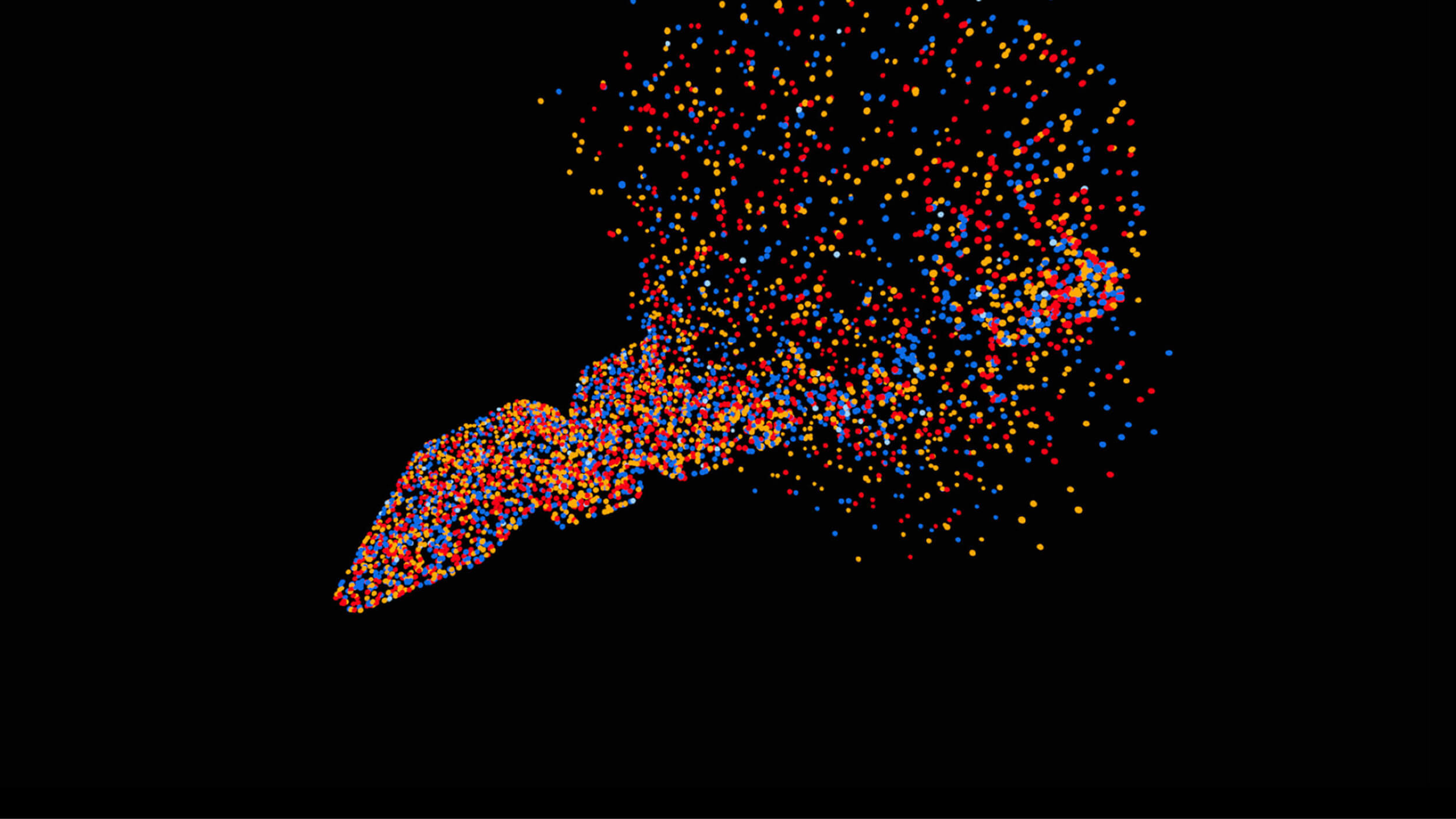
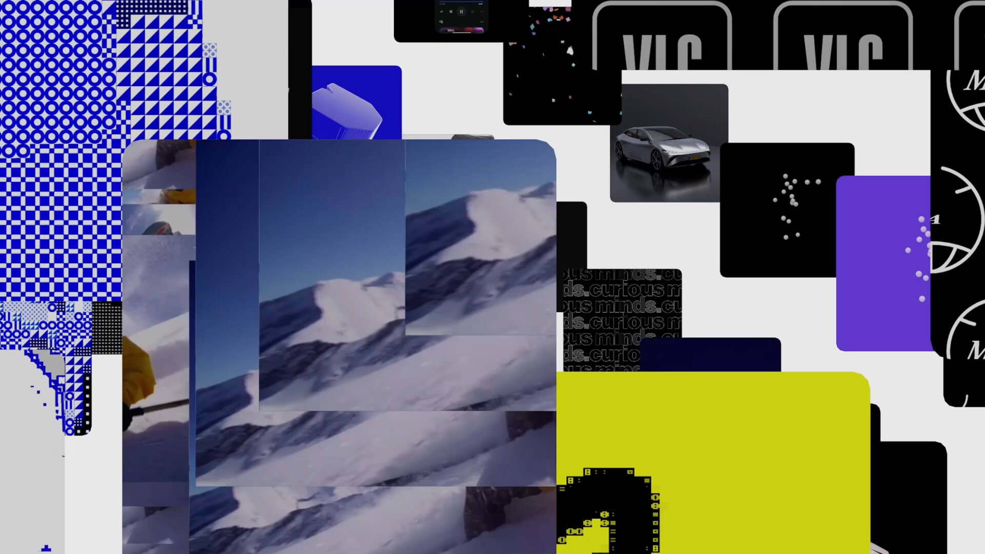
Our visual language bridges art and technology, analogue and digital, code and culture. We aim to leave a mark that lasts, both online and in the real world. Our approach mixes digital and real-life elements, keeping things grounded, relatable, and human.
We like things a bit raw and unpolished, but always with a clear idea and intent. It’s a balance between old and new, creative and strategic. We don’t follow the usual rules. Instead, we make work that feels honest, a little rebellious, and designed to make people stop and think.
More than a logo. A means of expression.
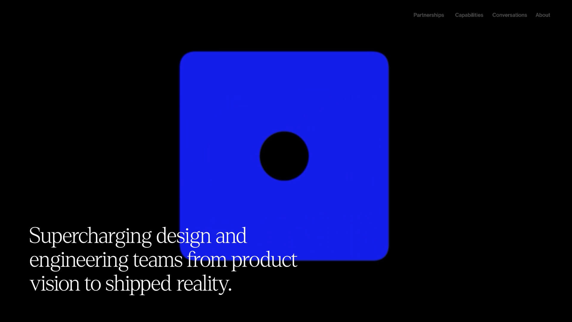
At the core of the DNA.inc visual identity, our logo reflects who we are. It balances the two sides of our personality. Bold but minimal, confident but refined. The shapes are clean and structured, with a modular setup that makes the characters feel like building blocks.
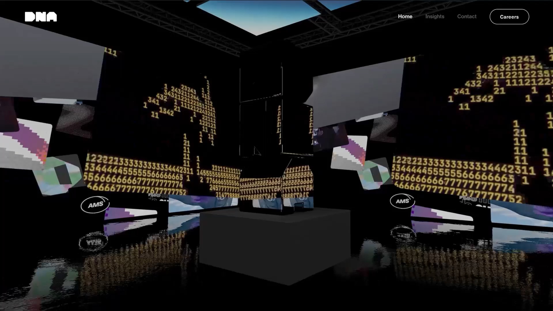
We use the logo as a vehicle to creatively express our identity, emotion, and vision. It’s not just a brand identifier, it’s also a canvas for ongoing exploration. By approaching it through an artistic lens, we move it beyond traditional branding and into a space of storytelling and experimentation. Like on our landing page for example, or the artwork in our offices. This way it becomes a way to communicate our identity, strategy, and values, while strengthening the connection between DNA.inc and artistic expression.
Being heard without following the herd
Our brand voice connects what we say – the message – with how we say it – the mojo. Voice for us is very different to tone: a constant grounded in our core traits, rather than a context-responsive mood that modulates it.
So instead of the classic ‘four adjectives’ found in Tone of Voice guides, we shaped our voice around three paradoxical behaviours: disarmingly sharp, quietly surprising, effortlessly magnetic. And three tonal ranges that let us read the room and attune to the mood. Not changing who we are, but responding to the moment. The logic doesn’t change, only how it is presented.
Instead of something like “we sound smart”, it’s a system we can apply. Driven by underlying philosophies of “say less, mean more”, “same-same is lame”, and “no push, just pull”. Instant decision-making tools that keep our language precise without being cold, cutting category clichés in their tracks, and keeping us humble while we flex.
Where do we go from here?
Looking back, for us this process has been more of an evolution, rather than a step or deliverable that set us on a fixed course. Over time, as DNA.inc has grown, our mission and vision have transformed, our team and the work we’re doing has changed with it. The whole process of becoming was one of growth, adaptation and exploration. It took some serious soul searching to uncover our true identity, one that felt like it’s honest, and uniquely ours opposed to something constructed out of borrowed pieces from other brands.
Our intent is to go beyond the realms of design and engineering. Our dream is to become a one of a kind, unique type of company, fusing technology with design, storytelling, and lifestyle components.
We have the aspiration to evolve into a platform or ecosystem where editorial content, experience design, events, products, and lifestyle elements can be woven into the mix. We set bold goals and strive to exceed them. And we are excited about our future.
Our brand identity allows us that space to become. It doesn’t just describe what we do, but works the way we do, too. Not boxing us in, but giving us enough structure to evolve without losing ourselves.